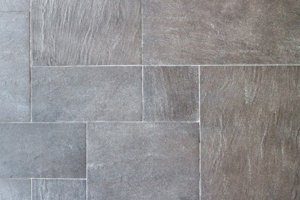
Whether you are leaning toward classic porcelain or investing in rare natural stone, selecting the type of tile is only one aspect of the overall design decision. Deciding on how the tile will be laid out is also crucial. To help you determine an ideal layout for your bathroom, kitchen, and beyond, below are some tile layouts to consider before ordering your choice of tile from your local tile flooring vendor in Orange County.
Stacked
This tile layout is straightforward and involves tiles aligned to create a simple repeating grid. The resulting look is modern, so it works well with crisp and clean angles and shapes. It’s also a great contrast to the organic look of wood. The stacked layout will also look great in contemporary rooms with rectilinear forms, particularly with bright grout or beveled-edge tile because it will highlight the Zen-like feel of such spaces.
Brick
One of the most classic tile layouts that look great with rectangular tile, the brick layout is an excellent option for practically any space. It can look particularly chic when combined with grout in a contrasting color, such as white tile with gray gout, highlighting its geometric pattern. You can also opt for the brick layout in a vertical orientation if you want to play up or elongate the space, instead of widening it. A vertical brick layout also lends a contemporary yet classic touch to any room. It is especially great in tiny kitchens and bathrooms.
Mosaic

This is basically any tiny tile in a repeated set of shapes or just one shape. Mosaics are usually used in accent walls or floors instead of full-height floors or walls since they will need a ton of grout. Because of this, they will need more maintenance if they’re going to be exposed to significant moisture or soil, which may be a big problem in spaces susceptible to mold and mildew. However, they can create a subtle yet rich multi-tonal look that gives the feel of upscale stone, minus the high cost.
Herringbone
The herringbone layout is achieved by installing tiles at right angles to form zigzag patterns or a predetermined mosaic. Both looks give off that high-end and sophisticated appeal, even when you use plain tiles. This layout, however, will need extra tile cutting at the edges, which means that you might end up with some waste. Because of this layout’s angular nature, it can give any space dynamic energy. Thus, it’s ideal for accent or feature walls. But it can look quite overwhelming when used on large surfaces. In transitional or traditional white on white kitchens, the herringbone layout can be especially striking and dramatic.
Basket Weave
This tile layout can transform standard subway tiles into interesting square units perfect for adding a subtly dramatic feel, like that of a herringbone pattern, minus the waste. The basket weave layout is also a nice fit for DIY enthusiasts because it looks complicated to install, but is really not.
Figuring out which tile layout can be daunting, so you have to consider certain factors to find the best one for you. Essentially, don’t forget to consider which room you’re using it, your personal style, and, of course, your budget.

